Share what you have built!


We would love to see what you all have been building. Please post your favorite new Dashboard below!
Comments
-
Can't wait to see all the cool things everyone has built!
Sydney Murrell
Client Success Manager
Foundant Technologies
0 -
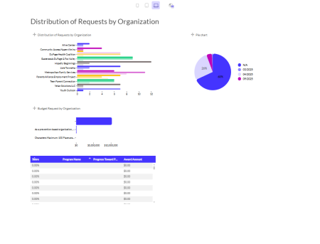
I am still very much swimming upstream in this. The data visualization tool is on my live site (not sandbox). Anyway, here is a picture of my first attempt.
 3
3 -
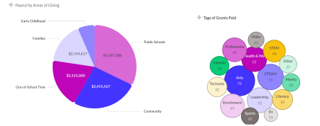
I am also still building and refining some dashboards, and working through some bugs with Support, but here is one of the visualizations regarding grants paid in one year.
 5
5 -
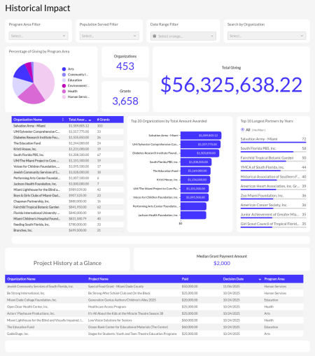
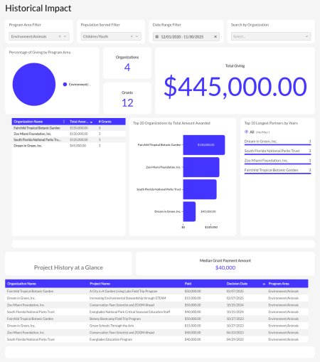
I think my favorite/most helpful dashboard is my Historical Giving Dashboard. This has helped me create a report that highlights grantee relationships and Foundation impact from many different perspectives without having to leave the screen.
I can see our historical impact through a frame of date ranges, program areas, populations served, or a combination like; Environmental Programs for Children over the Past Five Years
 3
3 -
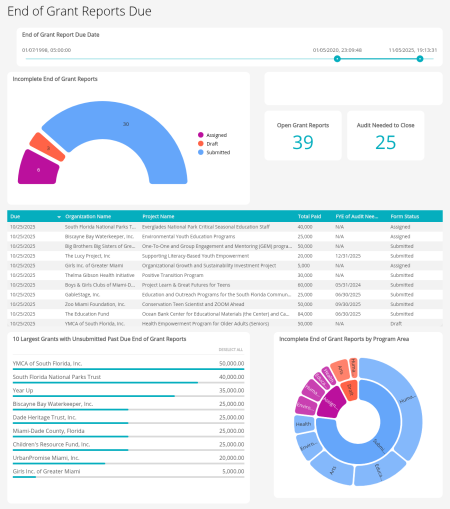
To help with workflow and grant management I also am enjoying my End of Grant Reports Due dashboard that helps me easily see what's due soon, what's missing, and what just needs an audit an close out
 2
2 -
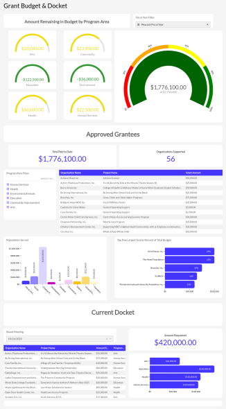
Last one I'll share — Our Grant Making Budget to help track our fiscal year giving. The top half measures the entire fiscal year while the bottom half helps plan one docket/board meeting at a time.
 1
1 -
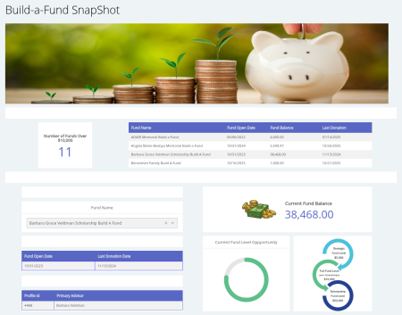
Simple Dashboard showing the status of our "Build-a-Funds".
 4
4 -
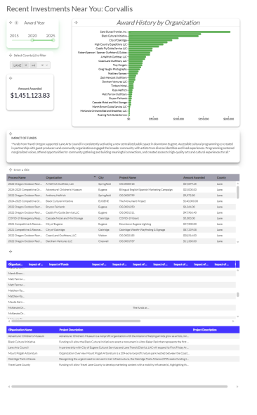
I've got a couple in progress, but this one is the most directly valuable . . . I used it to create a PDF that I can share with my board when they have meetings in different locations. By filtering the county and the year, I can highlight recent awards where they are visiting. I used the hyperlink feature to link back to final reports and grab a pull quote to share. What I'm learning in this report is that #1—we need to clean up our county data field (there are at least 5 different iterations of "Lane" county in the system, all of which show up in the filter drop down), #2—We have a different "Impact of Funds" field on every program, which has led us to developing a new process for building new cycles to assure fields like this are properly shared between cycles, #3—We need to update our payments more effectively because there is often a discrepancy in the amount awarded vs the amount paid and having easy access to the "why" of that difference is important for reporting accuracy.
3 -
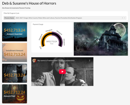
We’ve created a “House of Horrors” dashboard that has thrilled and chilled us with how much data cleanup we’re realizing we need to do!🎃
4 -
@susannefalen this one wins on vibes alone! It makes me so happy! And why not have fund on this internal resource that helps us identify extra work we are going to need to undertake. One day, it will be Deb and Susanne's Cozy Cottage of Closed Grants. :)
2


