Early Adopters - This Is Your Moment!


You've been busy building dashboards and pushing the limits of our new Data Visualization tool. Now it's time to share what you've created.
We're hosting a Data Visualization Showcase on March 31st, and we want YOU highlighted.
This is your chance to:
✨ Show off the dashboards you've been crafting
🎯 Inspire others with your creativity and use cases
All you need to do is share something you've built. Whether it's polished or a work in progress, big or small, we want to see it! If you've been experimenting with the tool, you have something worth sharing.
Ready to step into the spotlight? Please reply to this post with 'I'm in' or reach out to us at Support@foundant .com with the subject line 'Early Adopter Showcase participation' and I will contact you with details.
Comments
-
@KatieDecker and @SammieHolzwarth, thanks again for providing an opportunity for folks to share more about the dashboards they are building. It is super helpful and has given me some additional ideas to think about with my own dashboards.
—
I shared a dashboard I created in GLM for our program staff to view more details about the grant payments made during a year. Some asked for more about how I created that dashboard. I’ve outlined a few notes about it below the dashboard screenshot. If anyone has further questions, please don’t hesitate to reach out!
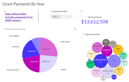
- We have two internal custom fields in our grant application: Areas of Giving and Tags (these are specialized focus areas).
- During our approval workflow, our team enters the appropriate information for these custom fields.
- During our approval workflow, our team enters the appropriate information for these custom fields.
- Dashboard items and specific data fields added, starting at the top and going left to right:
- Text Box: Reminder for staff about information filtering in dashboard
- Floating filter (Labeled Payment Year Filter): Installment Due Date
- Number with Evolution Chart (Labeled Total Grant Payout): Total of the installment amounts paid
- Pie Chart: Total of installment amounts paid by areas of giving
- Bubble Chart:
- Category Spot (this determines # of bubbles displayed): Tags
- Measure Spot (determines numeric value, higher the value the bigger the bubble): Tags
4 - We have two internal custom fields in our grant application: Areas of Giving and Tags (these are specialized focus areas).
-
@DevinCecere this is WONDERFUL! Thank you so much for coming back and adding this additional information. It will be so helpful for others!
1 -
Hi - I've been searching for help on this exact issue! I am having NO LUCK figuring out a bubble chart. How is your data organized? On my application, I built a chart for program areas because a single grant may hit multiple areas. (For example we have 428 grants, but 1198 data points across 10 areas.) Each program area is a different field. I can (and do) run a report that sums the numbers by field, but I can't seem to recreate it in Data Viz.
0 -
Hi @AmyBonner! For that bubble chart, the data is in the application form as one, checkbox list question type.
I'm happy to hop on a quick Zoom call to talk more if that would helpful to you at all.
1